Integrating TailwindCSS with PayloadCMS - Complete Guide
Author
Adrian Maj
Date published

TailwindCSS is a tool that enables quick and efficient component styling using utility-classes, significantly speeding up the development process. It also works great in applications based on PayloadCMS, however, its integration, especially with the admin panel (which is based on SASS), isn't as intuitive and simple as it might seem. The simplest approach of throwing Tailwind styles into the custom.scss file leads to unwanted effects in the panel (mainly by overwriting Payload's default styles), so it's worth doing it a bit differently – as you're about to find out.
In this guide, I'll show you how to properly configure TailwindCSS in a project with PayloadCMS, so that it works seamlessly in both the front-end layer of the application and the admin panel. You'll also learn how to efficiently implement shadcn/ui for components in the Payload panel – and beyond.
⚠️ Warning: In this guide, we're working with the latest version at the time of writing - v4.0. The configuration in version v3.x.x differs in how styles are scoped. You'll find the details below.
Project Configuration
The first step is creating a project using npx create-payload-app. If you're implementing TailwindCSS into an existing project, skip this step.
💡 Tip: If you're just starting your journey with PayloadCMS, check out my tutorial series - PayloadCMS from Scratch.
We move on to installing Tailwind, following the documentation, but focusing only on steps two and three.
We install TailwindCSS to our project using the command pnpm add tailwindcss @tailwindcss/postcss postcss
We create a postcss.config.mjs file in the project's root folder, and paste the following config into it:
1const config = {2 plugins: {3 '@tailwindcss/postcss': {},4 },5}6export default config
According to the documentation, we now need to import TailwindCSS into our CSS file. We do this in the src/app/(frontend)/styles.css file because there are no styles there that could be overwritten by Tailwind. This way, we'll avoid conflicts.
In the admin panel, however, we don't want to overwrite Payload's default styles, so in the src/app/(payload)/custom.scss file, we need to modify the way styles are imported slightly. We create a twp class that we'll assign to elements that should use Tailwind, and a no-twp class to exclude elements that shouldn't be styled by Tailwind.
⚠️ Warning: This solution doesn't work in Tailwind v3. In v3, you should use the Tailwind Scoped Preflight plugin instead. You can find an example implementation with this plugin in this blog's source code.
Both files should look as follows: src/app/(frontend)/styles.css
1@import 'tailwindcss';
src/app/(payload)/custom.scss
1@layer theme {2 @import 'tailwindcss/theme.css';3}45@layer base {6 .twp {7 @import 'tailwindcss/preflight.css';8 }910 .twp.no-twp {11 *,12 ::after,13 ::before,14 ::backdrop,15 ::file-selector-button {16 all: revert-layer;17 }18 }19}2021@layer components;2223@layer utilities {24 @import 'tailwindcss/utilities.css';25}
After pasting the code into custom.scss, the admin panel should remain in its original state – no default Payload styles should be overwritten. Just adding the TailwindCSS import in this file overwrites and breaks the default appearance, which is why it's necessary to scope Tailwind using the appropriate twp and no-twp classes (the class names are examples, you can change them).
Practical Application
From this point on, we can utilize the full potential of Tailwind in our application. While in the front-end layer of the application it's very simple - Tailwind is immediately ready to use, in Payload panel components, you need to add the twp class to the parent container so that all styles (including the default ones) are assigned correctly.
For the purposes of this guide, we'll create our own admin panel dashboard component. In our project, we create the file src/components/Dashboard/index.tsx and create a basic component.
1// src/components/Dashboard/index.tsx2export const Dashboard = () => {3 return <div>Dashboard</div>4}
Then in the payload.config.ts file, we add the path to our component in the following way:
1export default buildConfig({2 admin: {3 // ... admin config4 components: {5 views: {6 dashboard: {7 Component: '@/components/Dashboard#Dashboard',8 },9 },10 },11 },12 // ... rest of config13})
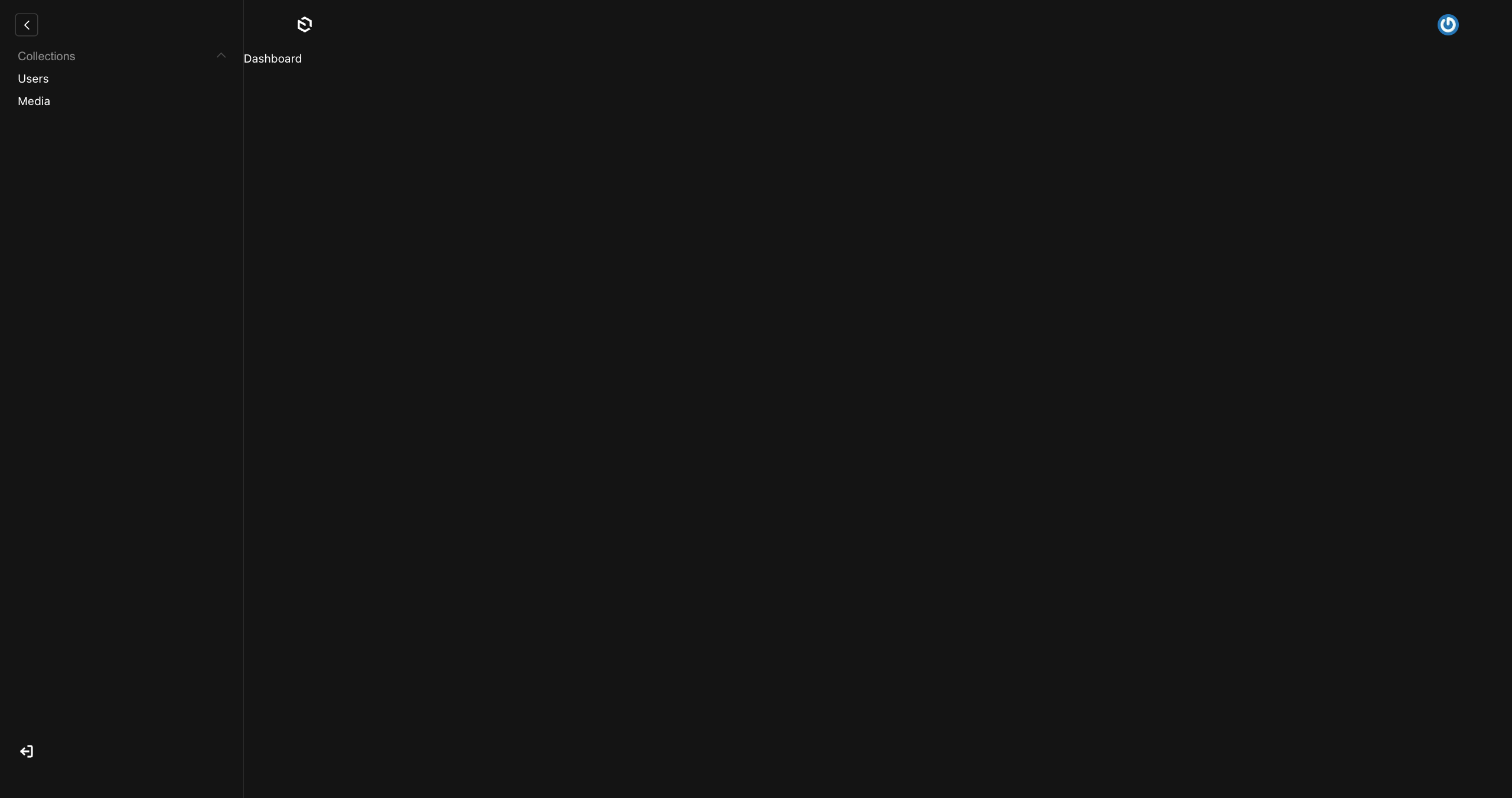
At this point, on the admin panel's main page, instead of the standard collections view, we should see a small "Dashboard" text.
💡 Tip: If you encounter an error with this change, check the path correctness, and generate the importMap using the command pnpm generate:importmap.
After replacing the default dashboard with our own component, we gain full control over its appearance, behavior, and style. Tailwind's utility classes work immediately without additional modifications, however, base styles are not automatically applied to the component.
For some elements (e.g., <input />), Payload automatically applies its base styles, which can lead to conflicts – especially when using UI libraries like shadcn/ui. The solution is to apply the previously created .twp class to the parent container, which will override Payload's default styles with TailwindCSS base styles.
1export const Dashboard = () => {2 return (3 <div className="twp flex flex-col w-full items-center gap-8">4 <h1 className="text-4xl">Dashboard</h1>5 <input className="bg-slate-900 text-2xl px-2 py-1 rounded-md" />6 </div>7 )8}
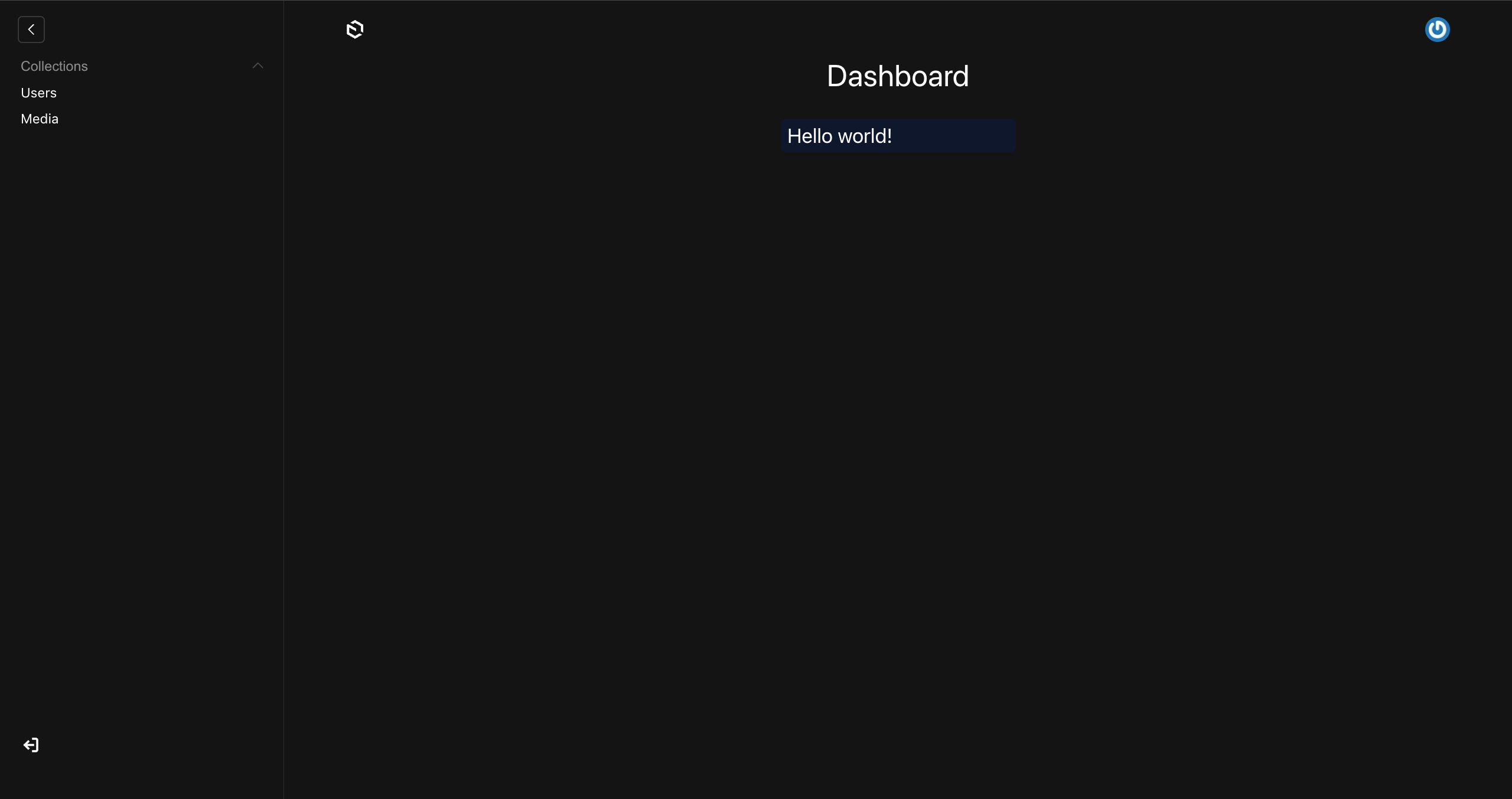
Here's the initially styled dashboard component. We can now freely modify all elements, and Payload's default styles (such as borders on inputs) have been correctly overwritten by Tailwind only in the created component, without affecting the entire admin panel.
Shadcn/ui components
Tailwind is a great foundation, but often we need ready-made UI components to speed up development. One of the most popular (and in my opinion, best) UI libraries based on Tailwind is shadcn/ui. Components from this library provide a solid base for building your own customized layouts – both in the Payload panel and in the user-facing part of the application.
An additional advantage of shadcn/ui is that components are generated directly in our project rather than being pulled from an external library. This gives us full control over their modifications, allowing us to fully adapt them to our needs and application style.
⚠️ Warning: The configuration discussed in this guide is for Tailwind v4. For v3, refer to the shadcn/ui docs.
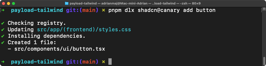
To use shadcn/ui components, we first need to initialize the library. We open the terminal in our project and run the command pnpm dlx shadcn@canary init
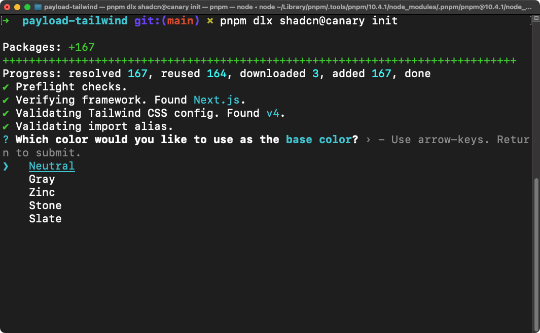
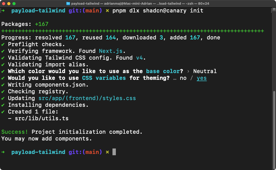
Depending on our preferences, we select the default color, and leave the CSS variables option at the default yes. After successful initialization, the terminal window should display the message: Success! Project initialization completed. You may now add components.
With the library initialized, we can add a sample component. You can find the list of components in the docs, however, keep in mind that currently, components adapted for Tailwind v4 need to be installed with the canary tag instead of latest, due to the recent update to v4. Let's add the Button component using the command pnpm dlx shadcn@canary add button
At this point, a button.tsx file with a button component will be created in the src/components/ui folder, however, currently the component will only display correctly in the application part from the src/app/(frontend) directory. This won't happen in the Payload panel because during initialization, shadcn placed its styles only in the styles.css file. The custom.scss file, which concerns the admin panel, wasn't populated with shadcn styles, and we need to do this manually, as well as apply some modifications. After opening the styles.css file, we can see that shadcn placed a lot of additional styles and variables there, the file should look something like this:
1@import 'tailwindcss';23@plugin 'tailwindcss-animate';45@custom-variant dark (&:is(.dark *));67:root {8 // ...variables9}1011.dark {12 // ...variables13}1415@theme inline {16 // ...variables17}1819@layer base {20 * {21 @apply border-border outline-ring/50;22 }23 body {24 @apply bg-background text-foreground;25 }26}
We copy the code from the @plugin 'tailwindcss-animate' directive up to the end of @theme inline and paste it at the very beginning of the custom.scss file, then we move the contents of @layer base from the styles.css file inside our twp class. This is how the completed custom.scss file should look:
1@plugin 'tailwindcss-animate';23@custom-variant dark (&:is([data-theme='dark'] *));45:root {6 // ...variables7}89[data-theme='dark'] {10 // ...variables11}1213@theme inline {14 // ...variables15}1617@layer theme {18 @import 'tailwindcss/theme.css';19}2021@layer base {22 .twp {23 @import 'tailwindcss/preflight.css';2425 * {26 @apply border-border outline-ring/50;27 }28 body {29 @apply bg-background text-foreground;30 }31 }3233 .twp .no-twp {34 *,35 ::after,36 ::before,37 ::backdrop,38 ::file-selector-button {39 all: revert-layer;40 }41 }42}4344@layer components;4546@layer utilities {47 @import 'tailwindcss/utilities.css';48}49
⚠️ Warning: In the @custom-variant directive, and in the second set of variables (previously under .dark), you need to replace the .dark class with [data-theme='dark']. This will allow the component styles to match the theme selected in the Payload panel.
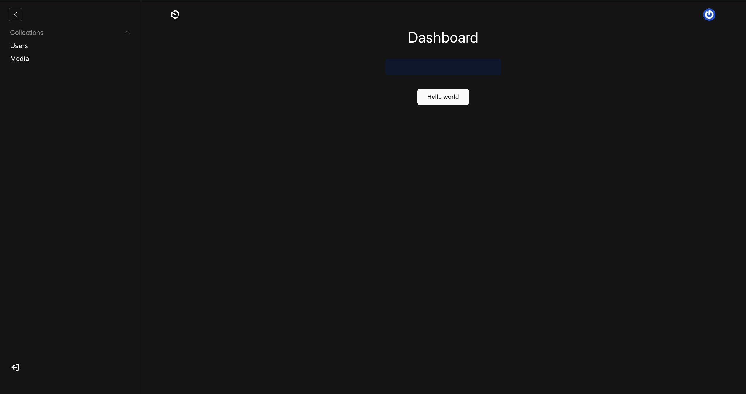
Now we can test the functionality by adding the Button component to our dashboard.
1import { Button } from '../ui/button'23export const Dashboard = () => {4 return (5 <div className="twp flex flex-col w-full items-center gap-8">6 <h1 className="text-4xl">Dashboard</h1>7 <input className="bg-slate-900 text-2xl px-2 py-1 rounded-md" />8 <Button size="lg">Hello world</Button>9 </div>10 )11}
Thanks to the changes made in the custom.scss file, our button should now correctly receive styles from shadcn/ui. Moreover, it will react to theme changes – both when switching from dark to light and vice versa. However, remember that components should be placed inside a parent container with the twp class assigned for default styles to be applied correctly.
⚠️ Warning: Components from shadcn/ui in the admin panel may have a smaller font size because Payload sets the font size to 13px instead of the default 16px. You can adjust the font size using Tailwind's text-[xx] classes, for example.
Summary
In this guide, I showed you how to effectively integrate TailwindCSS with PayloadCMS and enhance the project with a UI library. The presented configuration helps avoid typical problems with conflicting Payload styles and enables quick and efficient creation of custom Tailwind-based components. This solution provides a solid foundation for building visually consistent and functional applications.
You can find the source code with examples on my GitHub as usual. If you liked this post, check out my other entries as well. I also encourage you to follow my social media profiles to not miss any new Payload tutorials.
Learn how to create a new project in Payload and discover best practices for configuration that will help you take full advantage of its capabilities.
Learn how to create and manage collections and global data in PayloadCMS. Understand their differences, and structure your content efficiently.